So now that I got a small gap, I finally took courage to Dig a really old portfolio piece that I started some time ago. I was very ambitious with this project, but I wanted to make something that felt that the entirety of it felt hand-made. At the end of work and just laziness I never got to finish it.
I would like to however give another shot at this work of progress Piece and see if I can finish it for once an all so I can clear my space to make a new piece.
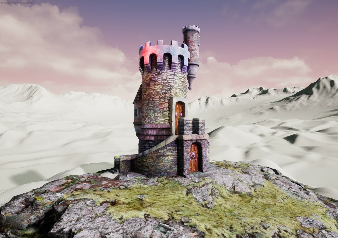
I'll see if I can show progress Next by Introducing some windows for the Tower, Some Preview Rocks, And a tree.
I added a ground with the aid of Quixel's Megascans but I did not just "slap it in" I did Load the tool in Zbrush. Smoothed and Stylized some of the details as it is a very Stylized Piece. Did some color corrections to replicate to the colors of the Illustration.
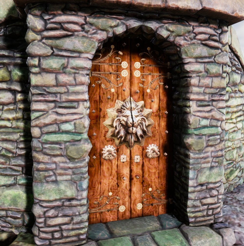
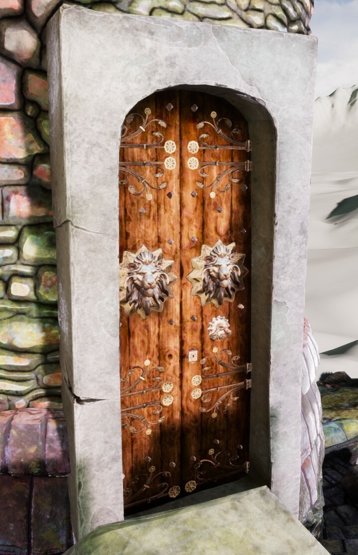
Bottom Door Piece. I haven't shown this to anyone yet but I worked on this a few months ago alongside this other version of the Upper Door.
I am honestly pretty new with Unreal. So after I do the remaining pieces I may learn deeply how to create materials for Terrains and how to introduce foliage with brushes. I hope I can show you the next update soon.
I understand that the piece has its problems but I will make amendments after the entirety of the pieces is in place. And currently, I am not really looking for feedback until it is complete and then I desire to make further changes.
Problems that I am aware:
- Bricks have an odd "ring" AO on them ( have just edited the pieces that have this linework to make it substantially less dark )
- Pieces have unique textures but they could benefit from simply having a repeating texture and using vertex color to make color differences.
- "its too much rock" Let the Eye rest
- Post-processing effect is "too pink"
https://polycount.com/discussion/152156/jabberwocky-tower-ut4
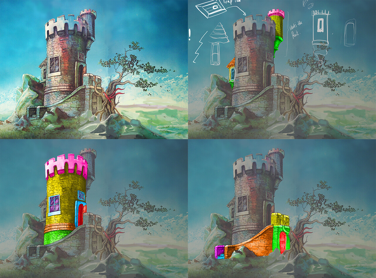
Concept art by Graeme Base


